
OVERVIEW
Redefining Sustainability Insights
This project marked the culmination of a semester-long exploration of sustainability platforms, focusing on refining the user experience of "Planetary Insights." Designed as a decision-making tool for sustainability managers, the platform required a comprehensive overhaul to address usability issues, improve data visualization, and enhance navigation. The result was a visually cohesive and intuitive platform that simplified the process of tracking and assessing environmental impacts.

PROBLEM
Untangling Complexity for Usability
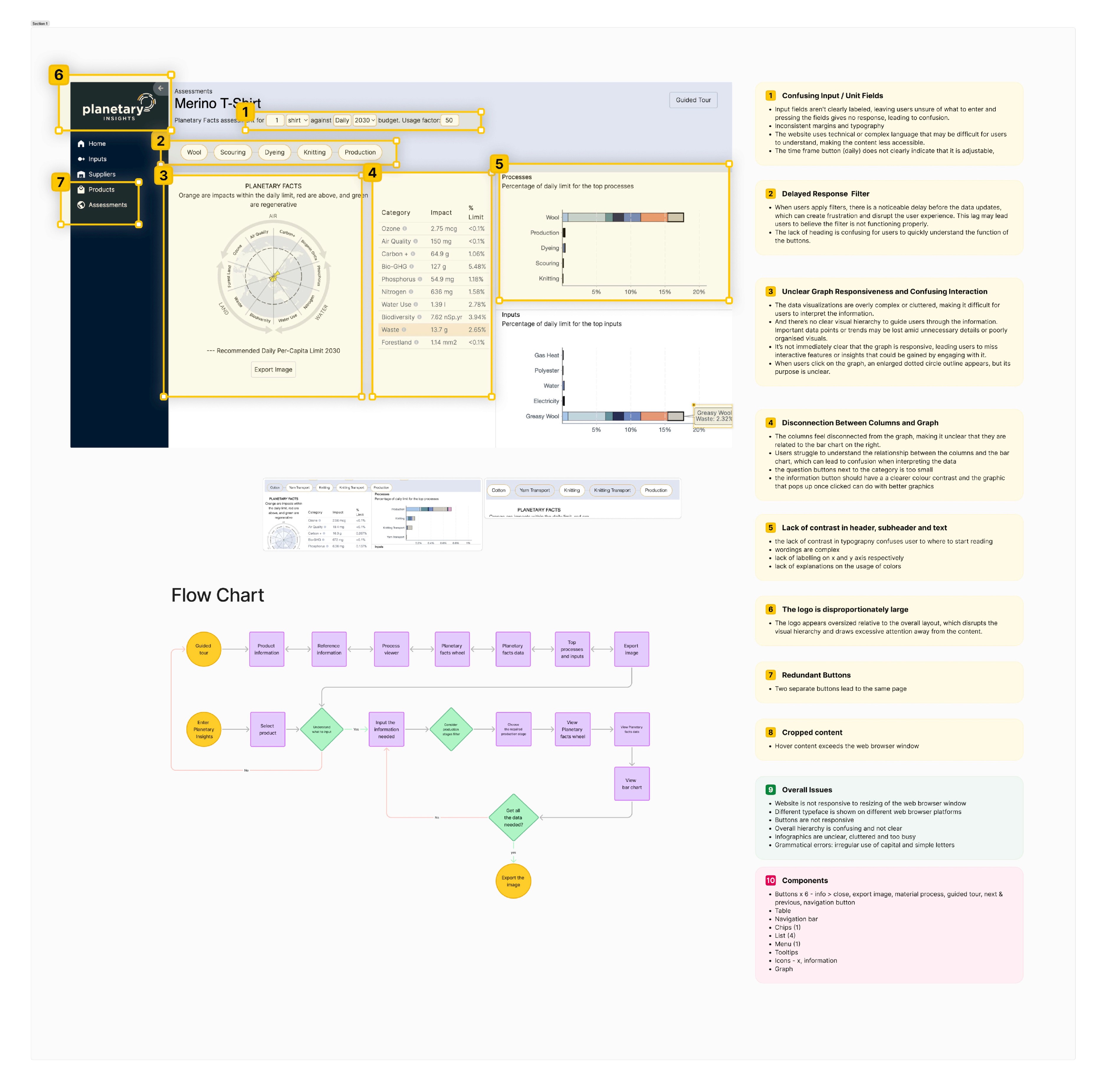
Planetary Insights is a platform empowering businesses to measure and manage the environmental impact of their operations, providing tools for tracking, analysis, and insights. The original platform suffered from several usability issues: 1. Information Overload: Cluttered landing page with poorly structured content. 2. Confusing Visuals: Data visualizations, especially the planetary graph, were overly complex, causing cognitive overload. 3. Lack of Clarity: Misleading search functionality and unclear navigation paths disrupted user workflows. 4. Inconsistent Design: Disjointed visuals diminished professionalism and credibility.
PROCESS

Researches
• Conducted empathy mapping to identify user frustrations with navigation and data visualization. • Created personas, like Rowena, to focus on user needs, such as simplifying complex data input processes.


SOLUTION
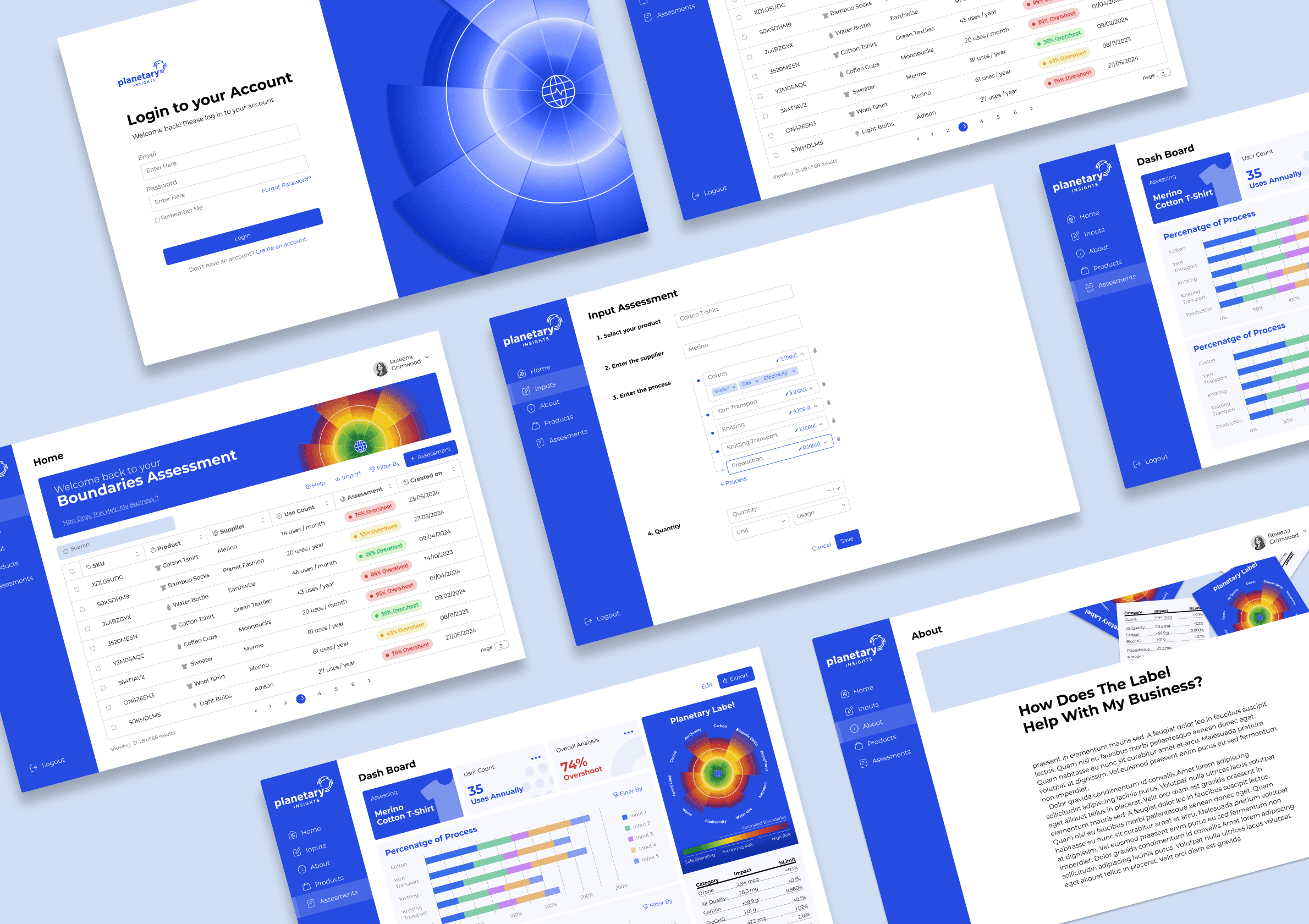
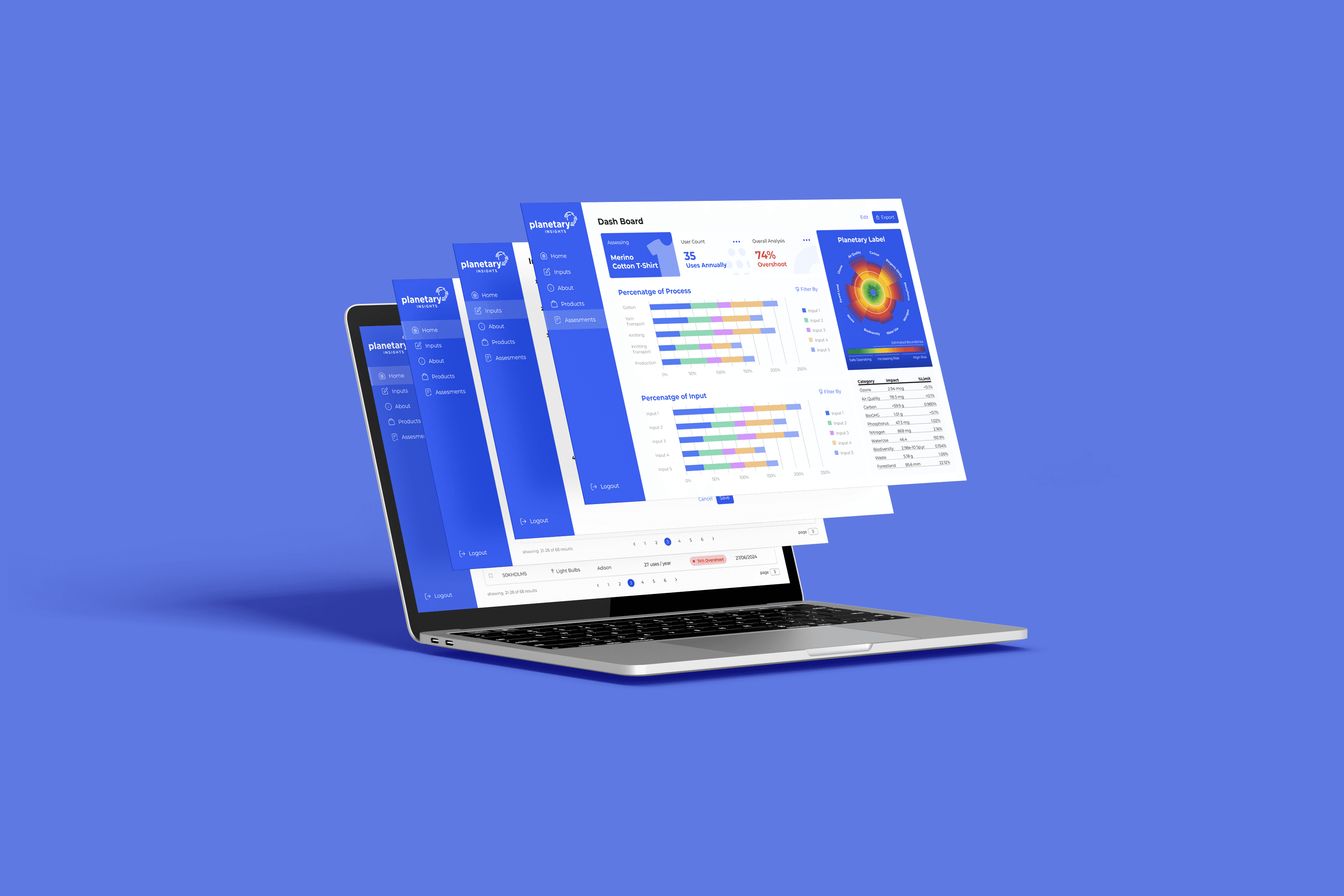
1.Home Screen
Streamlined data display with a spreadsheet-like layout, dynamic filters, and clear status indicators for quick access.

2.Input Assessment Form
Guided forms with step-by-step validation to ensure accurate data input and reduce errors.

3. Dashboard
Interactive radar charts and bar graphs providing visual clarity for sustainability metrics, enabling quick analysis of critical areas.

4. Onboarding Process
Step-by-step interactive guides for new users, easing the learning curve and boosting confidence in navigation.

5. Design System
A professional and cohesive system that ensured consistency across all components, enhancing the platform’s credibility.

How the solution making a difference?
Enhanced
data Input with Step-by-step forms with real-time validation improved accuracy and reduced user errors by 50%.
Simplified
Visual Interpretation with Color-coded metrics and interactive graphs reduced cognitive load.
Clear
layouts and logical workflows streamlined the user journey, cutting task completion time by 40%.
REFLECTION

Designing Clarity: Lessons Learned and Next Steps
Looking back on "Planetary Insights," I’m really proud of how i streamlined navigation, turning a cluttered experience into one that felt intuitive and approachable. We transformed overwhelming data into clear, actionable visuals, and built a cohesive design system that reinforced trust and professionalism. Still, deeper user research and iterative testing could have helped us uncover hidden pain points, refine usability, and ensure the platform catered more effectively to the diverse workflows and challenges faced by sustainability managers. This would have allowed us to further enhance both the accessibility and the impact of the platform.