Doughnut Economy -

Impact Visualiser Redesign

The Greater Melbourne City Portrait project, which utilized the Doughnut Economics framework to visualize sustainability metrics. The project sought to align ecological sustainability with social equity, providing stakeholders with actionable insights for informed decision-making.

Company


RMIT & Regen Melbourne

Tools


Figma
Figjam

Miro Board

Role


UIUX intern

Year


2024

As the UI/UX Intern with RMIT University and Regen Melbourne.My responsibilities ranged from creating intuitive interfaces, conducting user research, refining data visualisations and ensuring that complex metrics were accessible to policymakers, researchers, and the community. Additionally, I worked closely with the developer on the production process and guarantee a seamless and consistent user experience throughout the whole design process


Doughnut Economy
for Melbourne City
Portrait-

Impact Visualiser Redesign

The Greater Melbourne City Portrait project, which utilized the Doughnut Economics framework to visualize sustainability metrics. The project sought to align ecological sustainability with social equity, providing stakeholders with actionable insights for informed decision-making.

Company


RMIT & Regen Melbourne

Tools


Figma
Figjam

Miro Board

Role


UIUX intern

Year


2024

As the UI/UX Intern with RMIT University and Regen Melbourne.My responsibilities ranged from creating intuitive interfaces, conducting user research, refining data visualisations and ensuring that complex metrics were accessible to policymakers, researchers, and the community. Additionally, I worked closely with the developer on the production process and guarantee a seamless and consistent user experience throughout the whole design process


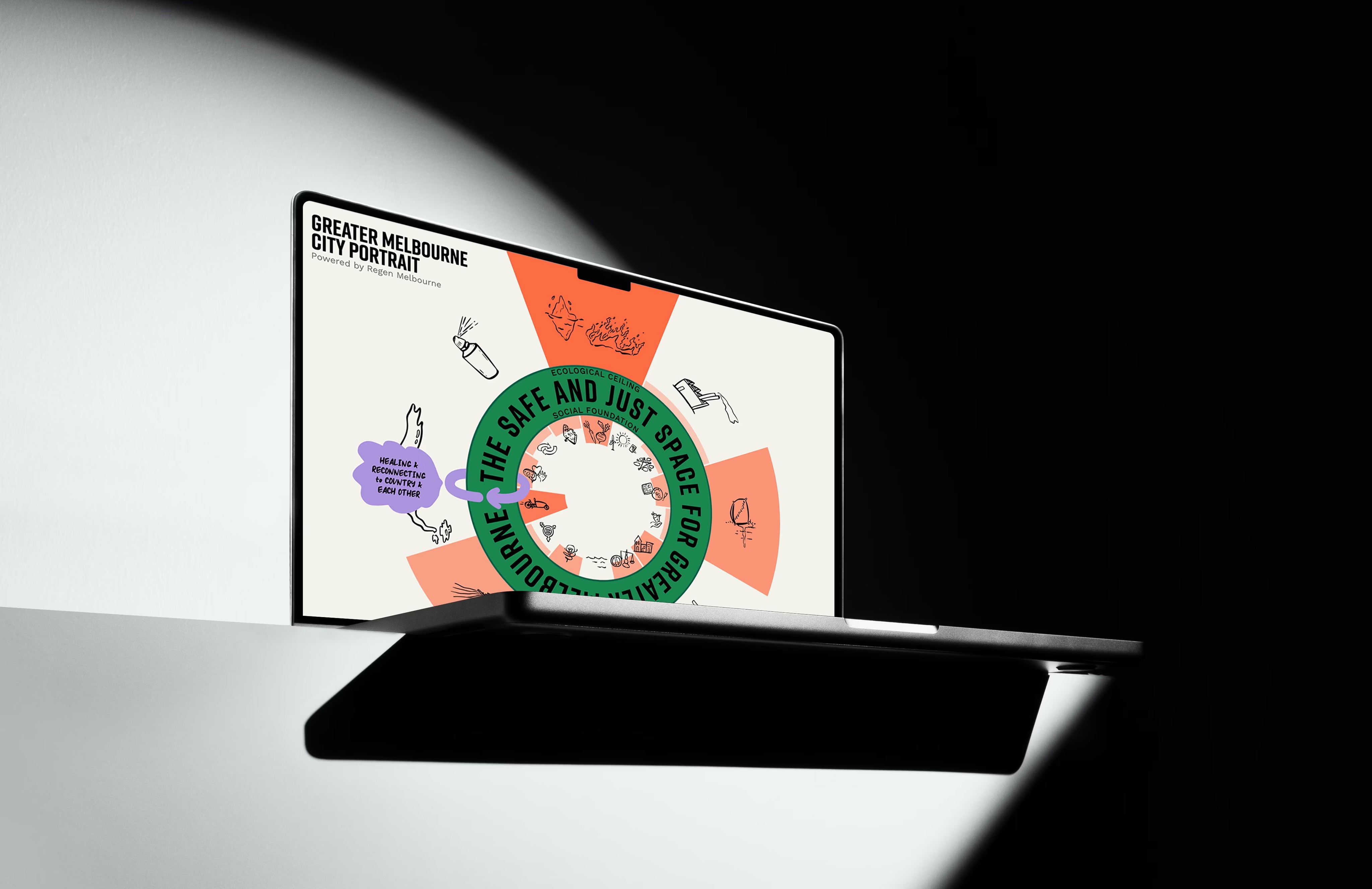
What’s This Doughnut Thingy?


Before reflecting on my work, I’d like to explain the concept of Doughnut Economics. The Doughnut, or Doughnut economics, is a visual framework for sustainable development – shaped like a doughnut or lifebelt – combining the concept of planetary boundaries with the complementary concept of social boundaries


This framework can be visualized in three main dimensions.


The inner dimension represents the “Social Foundation”, which encompasses the basic needs that must be met for a good quality of life.

The middle section, shaped like a doughnut, is the “Safe and Just Zone”, the primary goal of the framework. It aims to ensure that everyone’s needs are met without exceeding the Earth’s ecological limits.

The outer dimension reflects the “Ecological Ceiling”, indicating how well we care for our environment. While it’s essential to meet our social needs, we must also recognize the planet’s capacity to sustain us and maintain healthy ecosystems. Overshooting this ceiling can lead to ecological disasters.

The Doughnut Visualiser Redesign

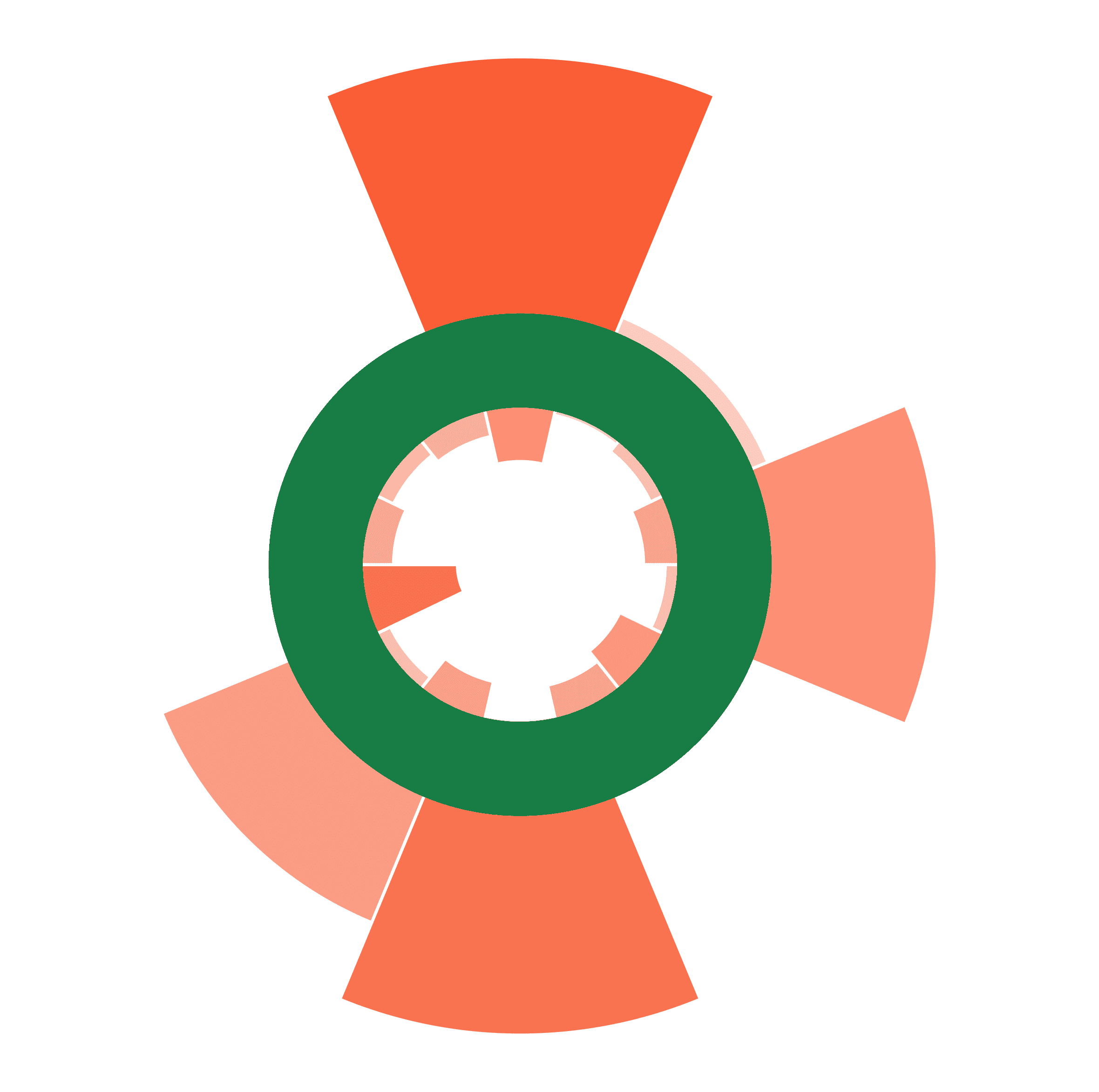
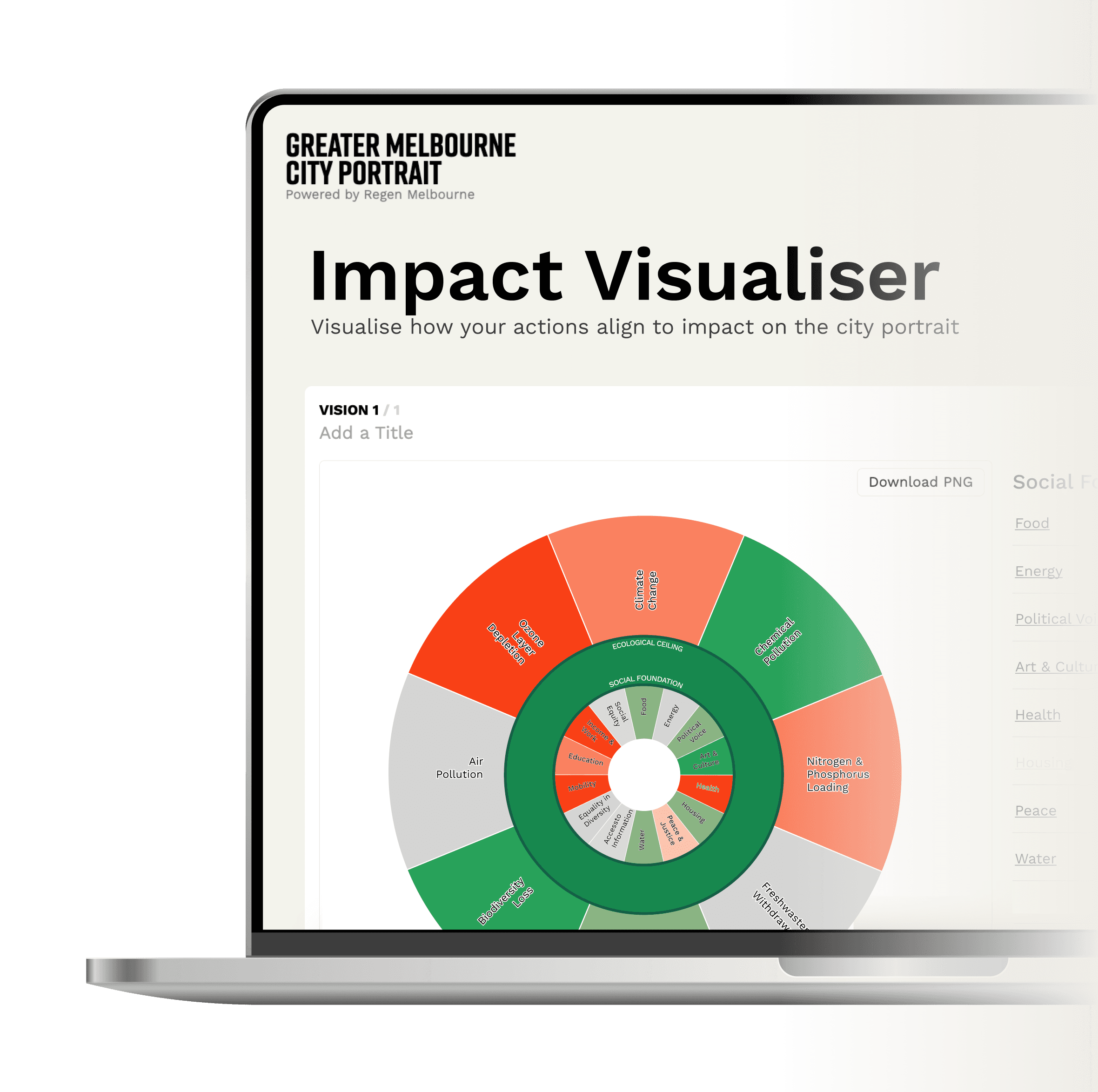
The original website faced critical issues, with its graph failing to illustrate key relationships. The Impact Visualiser tool acts as a predictive model, empowering users to apply the principles of the doughnut economy to their projects. We enable you to foresee potential impacts by clearly demonstrating how each lens translates into tangible, measurable outcomes.

Ambiguous visual language

Arrows pointing inward/outward lacked clarity; users struggled to know if movement toward the centre was “good.”

No onboarding or context

Users had no immediate understanding of the doughnut metaphor, safe zone, or how to interpret results.

Color overload

Bright reds and greens competed for attention, making text illegible and cognitive load high.

High search cost

Users repeatedly clicked between pages for definitions and had difficulty remembering indicator meanings.

Understand the user

We developed user stories and empathy mapping to help guide our journey to better understand how would they think and navigate when they are navigating through the tool. This allowed us to focus more on resolving user problems and their particular need.
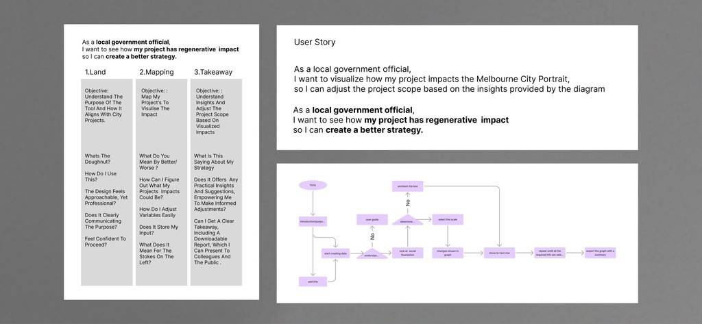
Journey Mapping

We convened a workshop with internal stakeholders to map the complete user journey with the original widget. This exercise pinpointed critical moments of friction, confusion, and disengagement. By visualizing each step—from initial exposure to completion—we identified key areas for improvement, ensuring our redesign directly addressed the most pressing pain points.

Empathy Mapping

In parallel with journey mapping, we created empathy maps to explore our users' emotional and cognitive experiences with the widget. By outlining what users say, think, do, and feel, we uncovered not only the functional shortcomings of the original design but also the deeper motivations and frustrations driving user behavior. These valuable insights guided our design decisions, ensuring our new solution truly resonates with user needs

Key pain points to address:

Complex Interactions

The original widget featured intricate controls and scattered information, making efficient user interaction challenging.

Visual Clutter & Overload

Users felt overwhelmed by the saturated, busy interface, struggling to read text and grasp data quickly.

Guidance on the Doughnut Metaphor

During our contextual inquiry, we discovered that users struggled to grasp the “Safe & Just Zone” concept—a crucial yet elusive idea. It was as if this vital principle was hidden behind a veil of ambiguity.

Project Objectives

1.

Enhance Usability
and Clarity

We redesigned the widget tool to deliver a clear, intuitive interface that accurately communicates complex sustainability data. Our objective was to replace ambiguous cues with straightforward, expressive elements—using variable‑thickness bars instead of arrows, streamlining control panels, and embedding contextual guidance. The goal is simple: ensure users grasp the data at a glance and interact without confusion.


2.

Empower Data-Driven Decision‑Making

We equip local government officials and stakeholders with the insights to make informed decisions. By providing immediate, accurate feedback on how projects align with the “Safe & Just Zone,” our tool empowers users to drill down into details and enabling adjustments to project scopes and strategies .

***
How might we improve the accessibility of the tool while allowing users visualize how their project impacts the Melbourne City Portrait, and adjust the project scope based on the insights provided by the diagram

***
How might we improve the accessibility of the tool while allowing users visualize how their project impacts the Melbourne City Portrait, and adjust the project scope based on the insights provided by the diagram

Early development

In the early stages, I created multiple hand-drawn sketches to explore innovative ways of refining the existing doughnut graph and dashboard panel. These initial ideas were crucial in shaping the visual hierarchy and interaction patterns that made the final design more intuitive and engaging.

What We Came Up With

After many rounds of trial and error, our journey led to a design where simplicity was key. Bold elements now replace subtle cues, and the visual language—mirroring the iconic doughnut graph—turns data into a vibrant story. Every color and line thickness narrates the impact, transforming technical details into an intuitive, engaging experience.


By focusing on usability, clarity, and intuitive guidance, we empower users—from local government officials to everyday stakeholders—to make informed decisions confidently.

Usability testing

Participants: 6 internal stakeholders (mix of designers, developers, project leads)
Tasks: Interpret impact direction; identify which lens is active; explain takeaway insights

Participants: 6 internal stakeholders (mix of designers, developers, project leads)
Tasks: Interpret impact direction; identify which lens is active; explain takeaway insights

Nicole
Procurement Manager


What is the intention of the widget? Maybe a couple of sentences above to explain what it is we’re hoping to visualize would help? Is there data supporting what we do when the user either rates their action vs. on scale? Can the user see how it interconnects with the dimensions/impacts?

Nina
Sustainability Analyst


Conscious that it is very subjective when rating your vision. Could there be a different method to guide how impactful the change is, so we aren’t all selecting the best rating by default?”

Kai:
Sustainability Analyst


I think we might need one more layer of engagement so that people don’t just auto‑select ‘much better’ for everything. The power of this is getting people to engage with the inherent trade‑offs in a big way.

Some insights from testing

Enhanced Clarity:

Users need a clear explanation of the widget’s purpose and how the various dimensions interconnect, which suggests adding an introductory note or onboarding guidance.

Structured Rating Guidance:

The current rating scale appears too subjective, prompting us to consider mechanisms that help guide users in making more balanced and deliberate evaluations.

Increased Engagement:

Feedback indicates that the design should encourage deeper user interaction—adding layers of engagement to highlight trade-offs and avoid defaulting to overly positive ratings.

Final Deliverables

The doughnut‑style chart instantly communicates a project’s regenerative impact on Melbourne’s social and ecological boundaries. It features two concentric rings: the outer ring displays high‑level categories, and the inner ring shows specific indicators. Color intensity—green for improvement, red for decline—encodes both direction and magnitude of change. With a clear title, scenario naming, and a one‑click PNG download, the Visualiser empowers decision‑makers to grasp insights at a glance and share actionable results seamlessly.

The doughnut‑style chart instantly communicates a project’s regenerative impact on Melbourne’s social and ecological boundaries. It features two concentric rings: the outer ring displays high‑level categories, and the inner ring shows specific indicators. Color intensity—green for improvement, red for decline—encodes both direction and magnitude of change. With a clear title, scenario naming, and a one‑click PNG download, the Visualiser empowers decision‑makers to grasp insights at a glance and share actionable results seamlessly.

Toggle Controls & Impact Bars


The redesigned control panel replaces cluttered checkboxes and multi‑colored buttons with clean toggle switches and horizontal impact bars. Each indicator is organized under its lens—social or ecological—and toggling one highlights its corresponding segment on the doughnut chart. The bar's length and saturation convey the magnitude and direction of impact (green for positive, red for negative), while a hover tooltip displays exact values and definitions. This streamlined approach reduces visual noise, clarifies selection states, and supports rapid comparisons without overwhelming the user.

The redesigned control panel replaces cluttered checkboxes and multi‑colored buttons with clean toggle switches and horizontal impact bars. Each indicator is organized under its lens—social or ecological—and toggling one highlights its corresponding segment on the doughnut chart. The bar's length and saturation convey the magnitude and direction of impact (green for positive, red for negative), while a hover tooltip displays exact values and definitions. This streamlined approach reduces visual noise, clarifies selection states, and supports rapid comparisons without overwhelming the user.

Graph Update

Each lens or indicator in the Impact Visualiser is interactive—clicking its label opens concise definitions and contextual descriptions (e.g., “Food: Production, Consumption, Circularity”). This progressive‑disclosure pattern keeps the main dashboard uncluttered while giving users instant access to the precise meaning and implications of each metric.

Each lens or indicator in the Impact Visualiser is interactive—clicking its label opens concise definitions and contextual descriptions (e.g., “Food: Production, Consumption, Circularity”). This progressive‑disclosure pattern keeps the main dashboard uncluttered while giving users instant access to the precise meaning and implications of each metric.

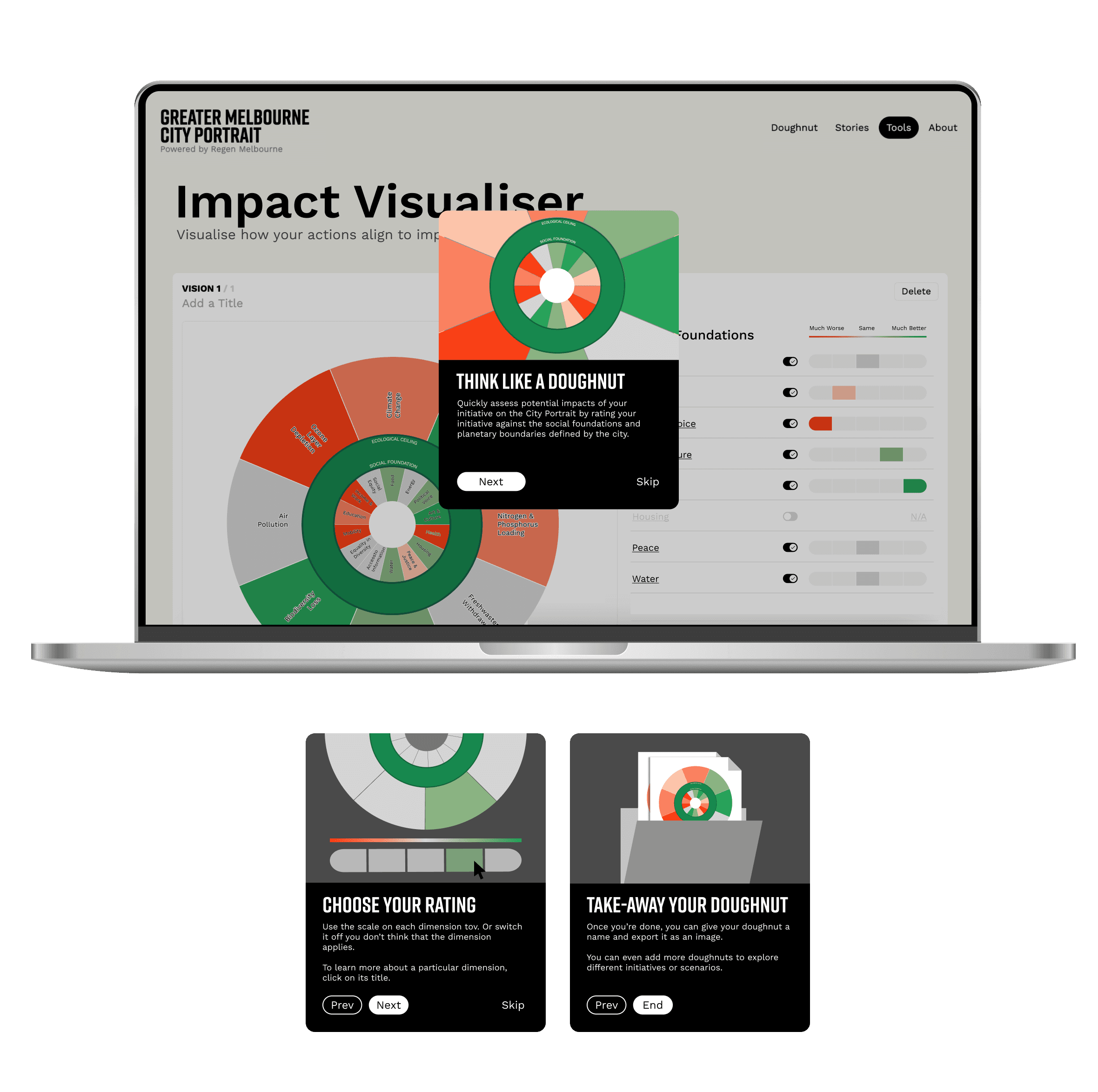
Onboarding Walkthrough

Each lens or indicator in the Impact Visualiser is fully interactive. Clicking a label reveals concise definitions and contextual descriptions (e.g., “Food: Production, Consumption, Circularity”). This progressive disclosure approach keeps the dashboard clean while offering instant access to the meaning and implications behind each metric—ensuring users stay informed without feeling overwhelmed.

Each lens or indicator in the Impact Visualiser is fully interactive. Clicking a label reveals concise definitions and contextual descriptions (e.g., “Food: Production, Consumption, Circularity”). This progressive disclosure approach keeps the dashboard clean while offering instant access to the meaning and implications behind each metric—ensuring users stay informed without feeling overwhelmed.

Impacts

◤ Streamlined Interface & Consistency:

The update replaces ambiguous elements with clear components like variable-thickness bars and simplified toggles, creating a consistent visual language that helps users navigate the interface confidently.

◤ Improved Clarity & Usability:

The redesign—featuring a clearer doughnut chart with explicit “Safe & Just Zone” boundaries and intuitive visual cues—helps users understand complex sustainability data at a glance, reducing confusion and cognitive overload.

◤ Enhanced Engagement & Decision-Making:

With interactive elements such as hover tooltips, progressive disclosure, and status pills that offer instant feedback, users are now more engaged and empowered to make informed decisions based on accurate, actionable insights.

@designed by AddieCheung 2024