

Table of Contents
The Problem
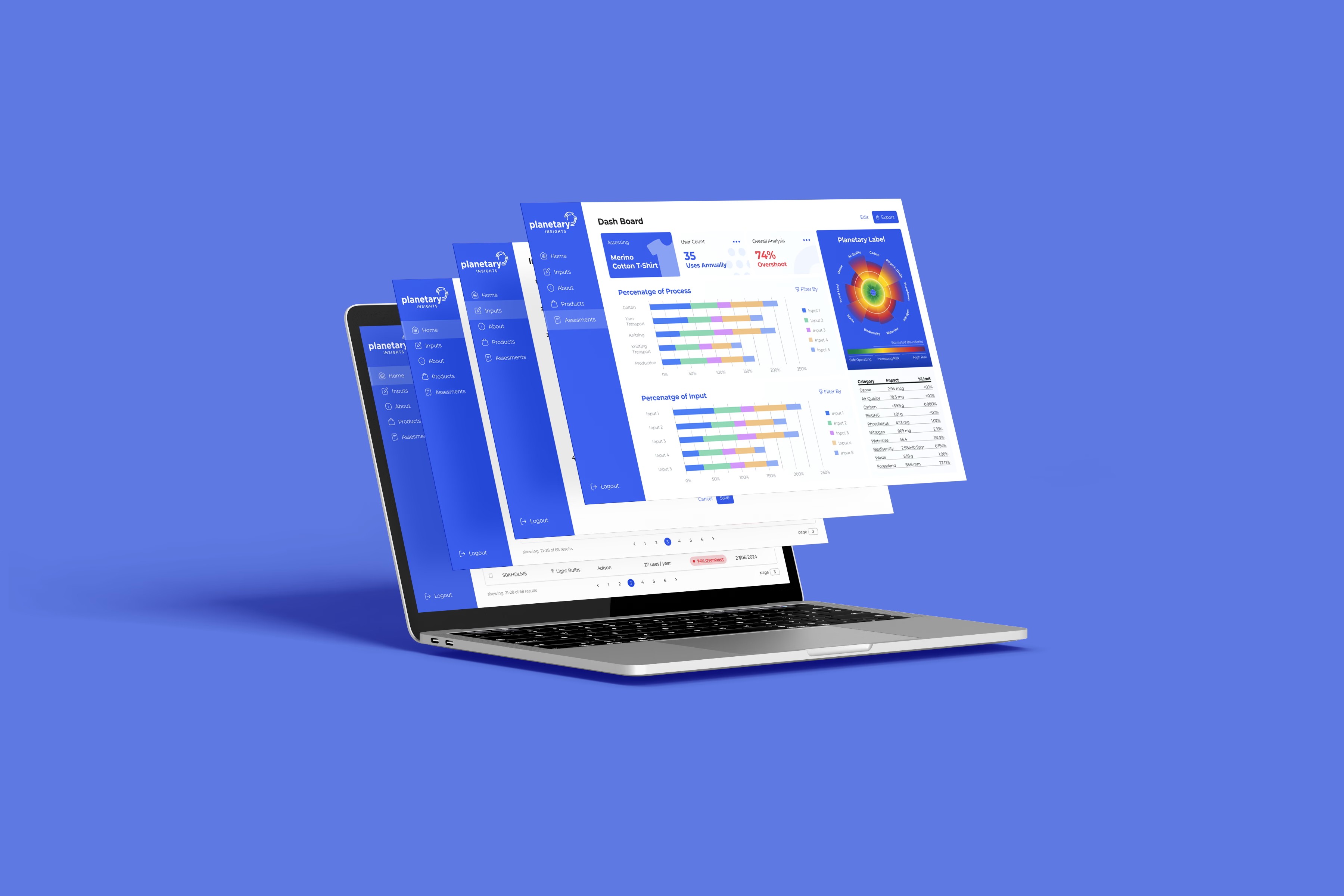
Planetary Insights is a climate-tech company simplifying science-based sustainability decisions by turning complex data into actionable insights.
Their flagship tool, the Planetary Facts Assessment, lets businesses upload product and supplier data to instantly evaluate their impact across the ten Planetary Boundaries—from carbon and water to biodiversity loss—all benchmarked against safe operating limits.
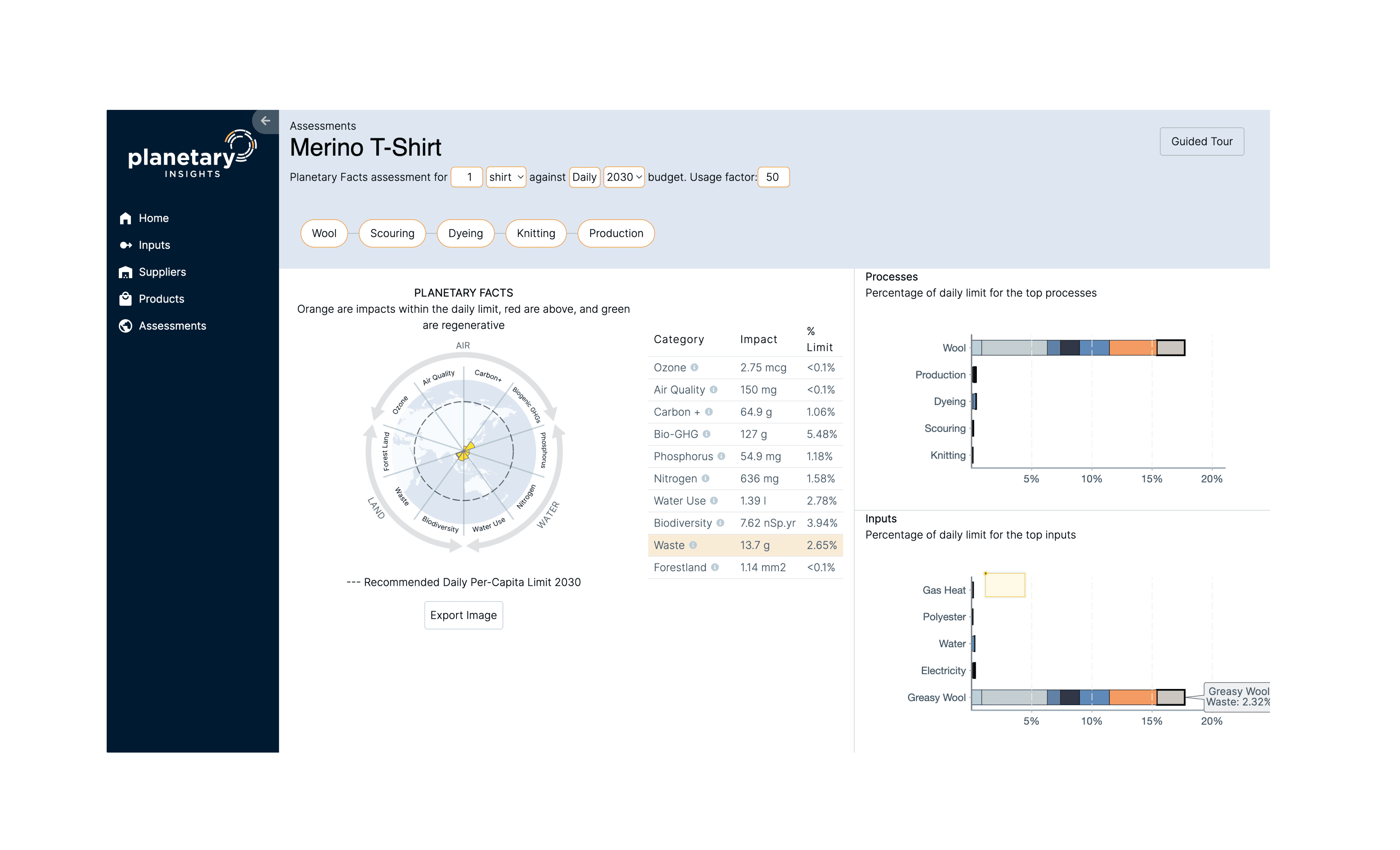
However, the current interface is cluttered and non-responsive. Unclear labels, slow filters, and disconnected visuals make data entry frustrating and insights hard to access—blocking users from quickly understanding or improving their sustainability performance.
Research Approach
With limited access to external stakeholders, we combined targeted secondary research, hands-on mapping, and small-scale user testing. This mixed-method approach revealed key workflows, pain points, and decision drivers for sustainability managers—across both large enterprises and small businesses—allowing us to focus on the most impactful improvements.


Desk research & benchmarking
Reviewed industry reports, academic articles, and competing sustainability platforms to understand how sustainability managers source, interpret, and act on environmental impact data.
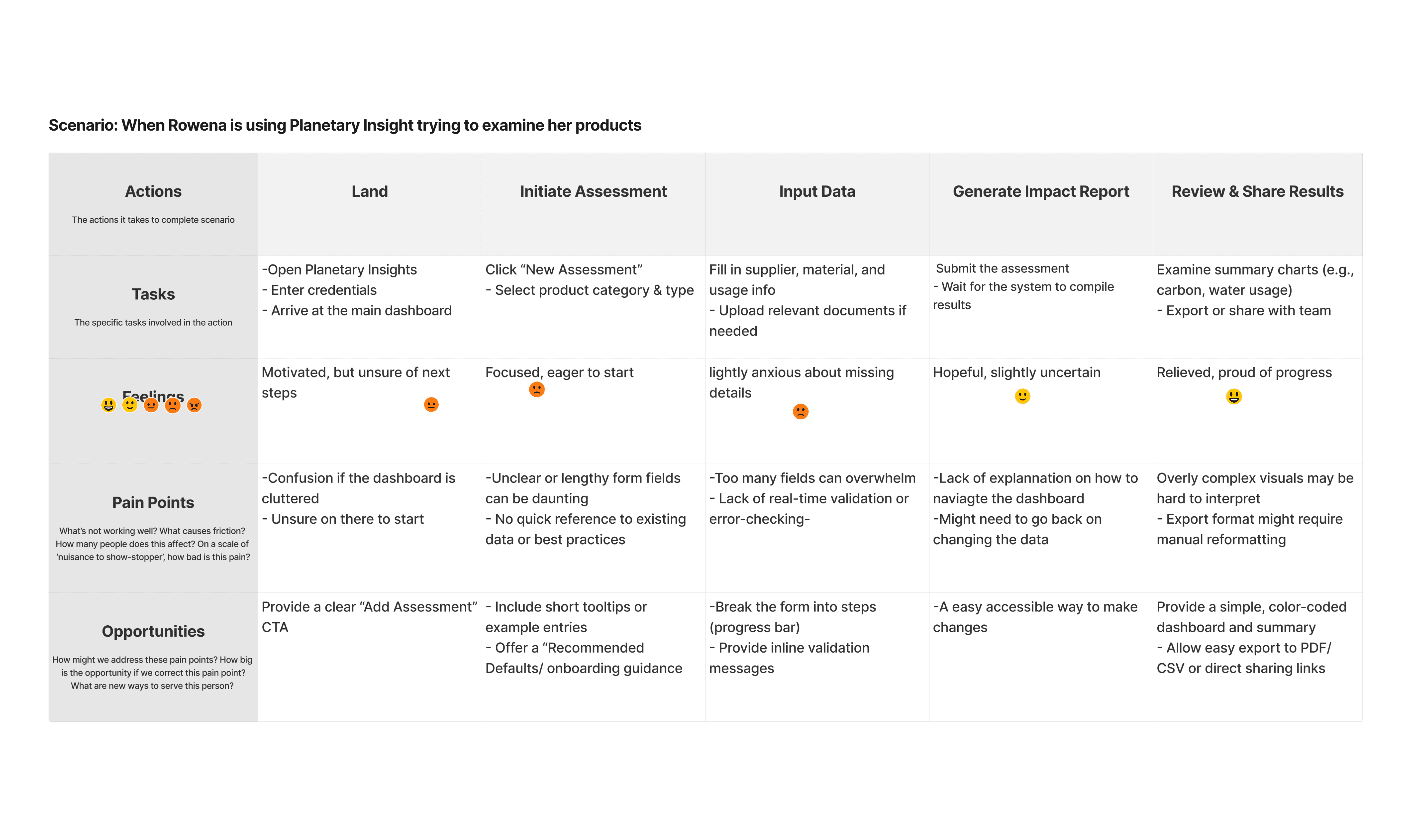
Journey mapping & user stories
Created end‑to‑end journey maps and 5+ user stories for different customer types (enterprise vs SME) to identify critical decision points, information needs, and friction areas in the current workflow.
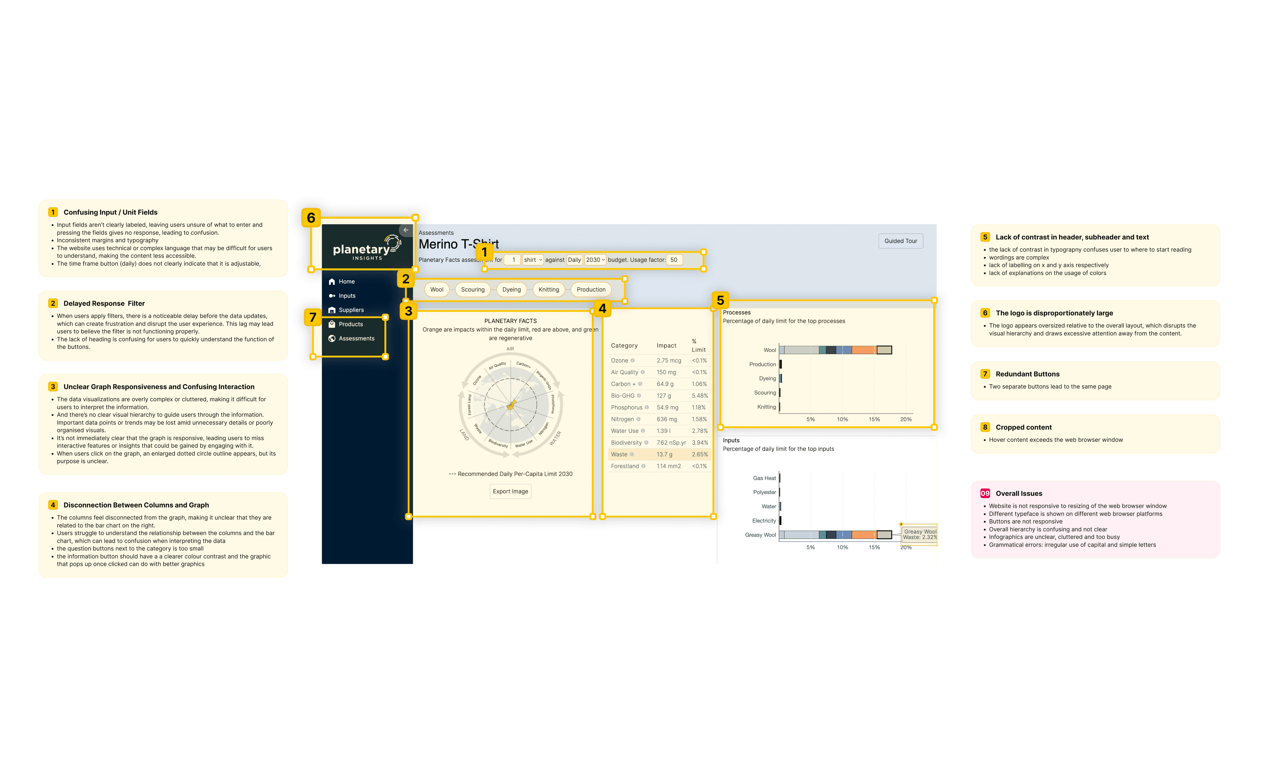
Heuristic audit & usability testing
Performed a UX audit of the existing interface, then ran quick usability tests on low‑fidelity prototypes to prioritize features, refine information hierarchy, and ensure clarity of key visualizations.
Key Findings
ALL USER TYPES STRUGGLE WITH A COMPLEX, INCONSISTENT UI THAT OBSCURES ACTIONABLE INSIGHTS
Regardless of role—whether managing procurement, tracking sustainability metrics, or advising clients—participants found the current interface confusing, cumbersome to navigate, and unclear on where to start, preventing them from quickly understanding product impacts.
Procurement Manager
”
I don’t even know where to begin entering product data—it feels overwhelming.
Need a clear, guided data‑entry workflow with step‑by‑step prompts
Sustainability Analyst
”
I spend more time deciphering charts than analyzing impact.
Need simplified visualizations with obvious hierarchy and context
Product Owner
”
Adding multiple products is painful — I lose track of what’s done.
Need bulk upload capability and progress indicators
Sustainability Consultant
”
I need quick client reports, but the insights are buried.
Need customizable dashboard with easy filtering and export options
Design Principles
After synthesizing our research, we defined four guiding principles to shape every part of the redesign—ensuring the solution is intuitive, impactful, and scalable from the ground up.
Simplicity
Streamline workflows with step‑by‑step, guided data entry and clear navigation so users can input single or multiple products without friction.
Actionability
Surface prioritized insights in a focused dashboard, highlight impact “hotspots,” and provide contextual next steps and exportable reports to drive sustainable decisions.
Scalability
Support both SME‑level and enterprise‑scale assessments seamlessly via bulk uploads, progress indicators, and performant filtering across hundreds of products.
Consistency
Establish a unified design language — cohesive typography, iconography, and component patterns — to eliminate confusion and build user trust.
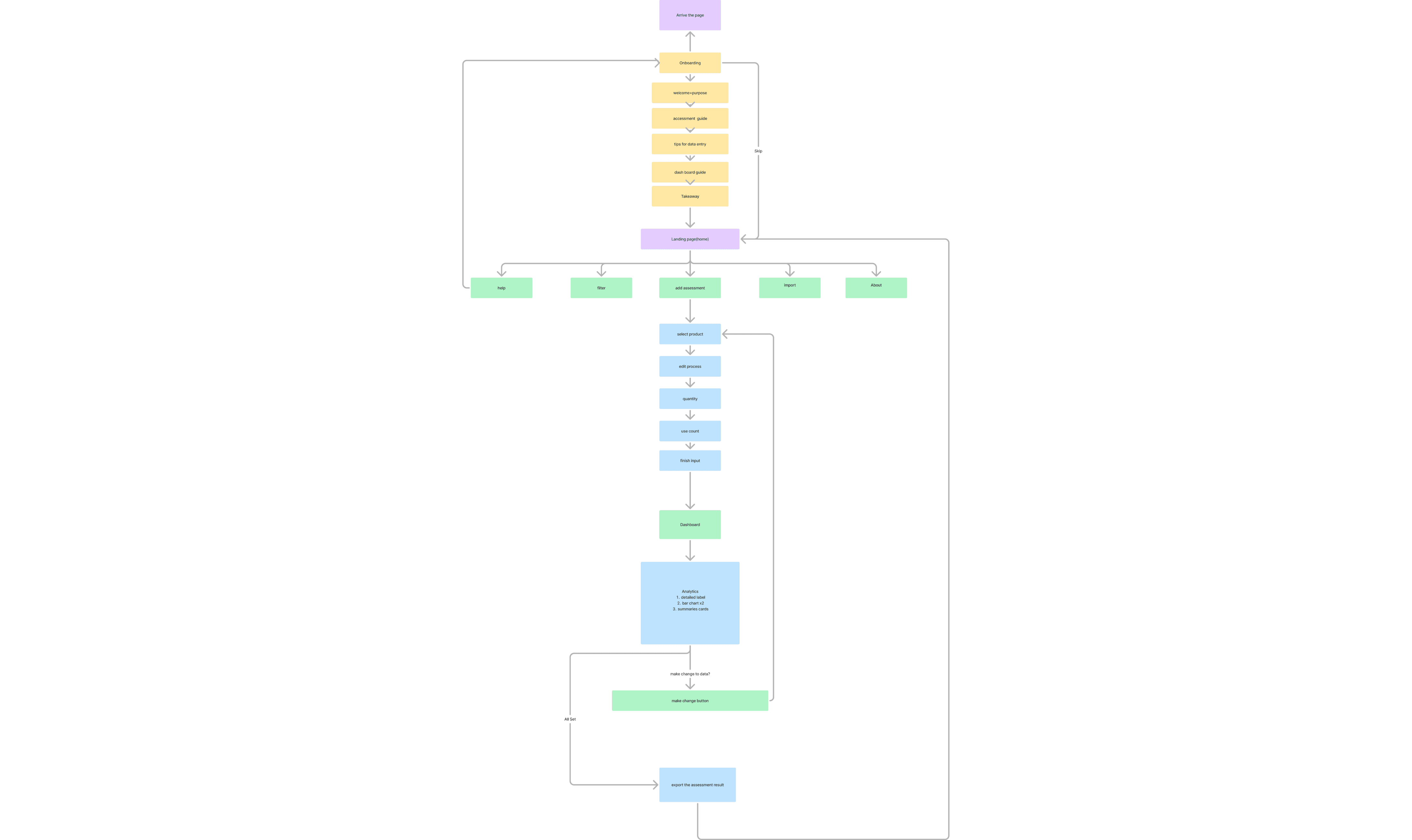
Information architecture
To support a seamless user journey—from onboarding to data entry, analysis, and export—we distilled our IA into four core task flows: Onboard, Assess, Analyze, and Act, supported by lightweight utility pages. This structure aligns with key user goals uncovered in journey mapping and minimizes cognitive load throughout the experience.
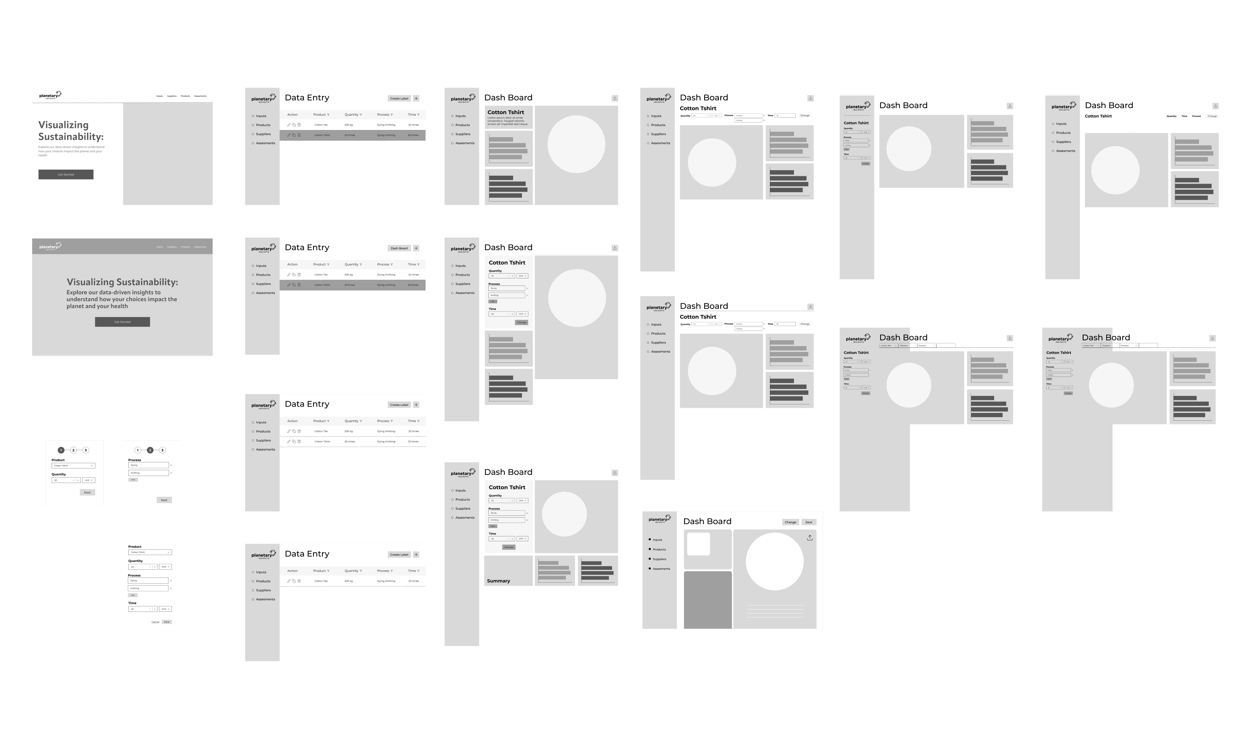
Early exploration
In the early redesign phase, I jumped into low-fidelity wireframes to quickly explore and validate core user flows—without getting caught up in visual details. Using Figma, I sketched multiple versions of the landing page, data-entry table, and dashboard, testing variations in navigation (sidebar vs top nav), input workflows (inline edits vs modals), and content layout (summary cards vs full-width charts).
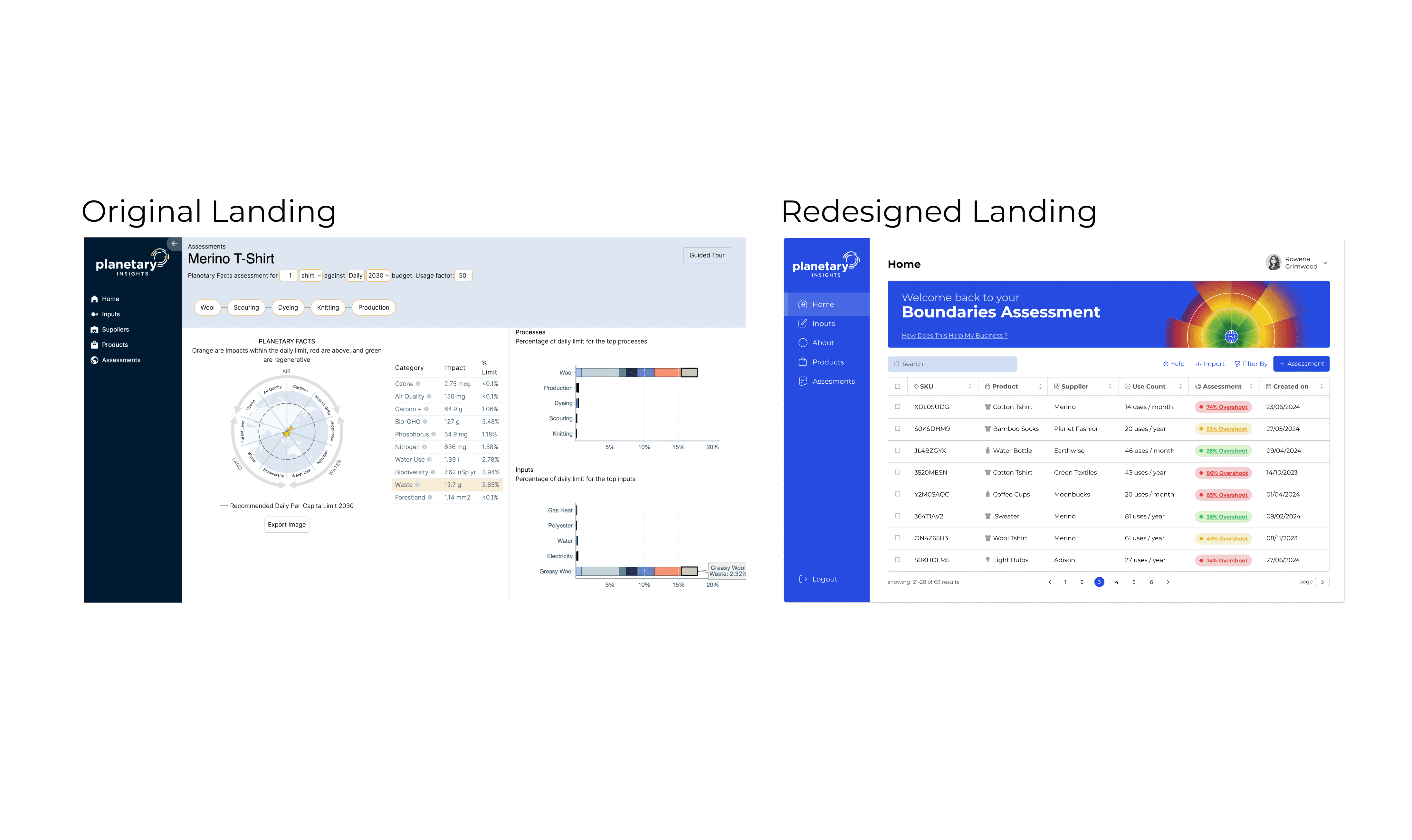
Dashboard design
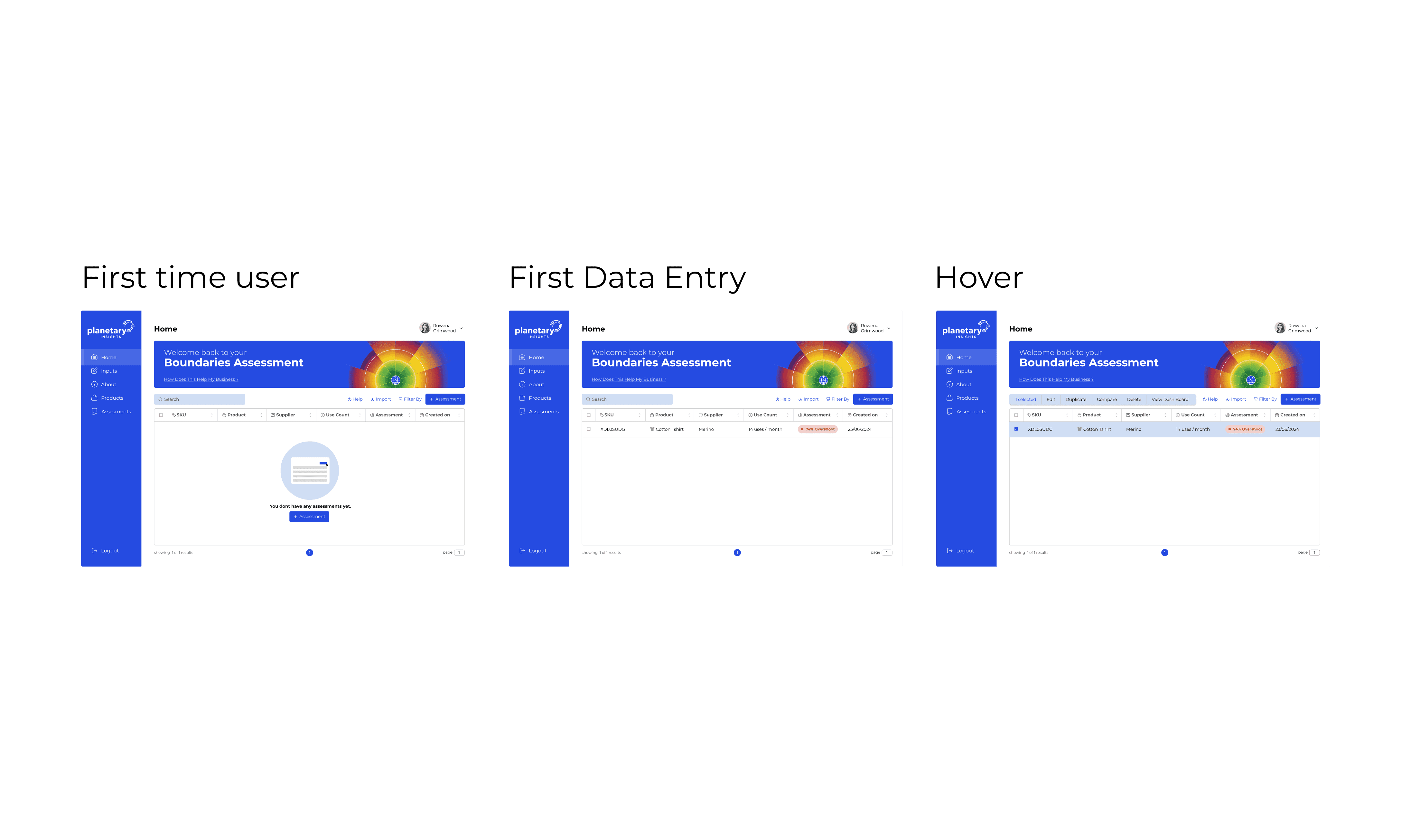
The redesigned dashboard turns a cluttered, hard-to-scan interface into a clear, action-focused hub. On first use, a friendly empty state with a single “Add Assessment” CTA guides users into the workflow.
Once data is added, a searchable, sortable table displays each product’s SKU, name, supplier, usage, and a prominent status badge (e.g., “50% Overbudget”)—making it easy to spot high-impact items at a glance. A persistent filter bar and global impact visualization sit above the table, helping users quickly refine their view and grasp overall performance without digging through menus.


Input assessment design
The redesigned Input Assessment transforms a confusing, multi-step form into a streamlined, intuitive workflow. Users start by selecting a product and supplier, then expand a clear process tree to add or edit inputs inline—eliminating the need to navigate disconnected fields.
Contextual side panels appear only when needed, letting users enter quantities, units, and usage (for gas, materials, or energy) right next to the relevant process step—reducing friction and keeping everything in context.
Assessment result design
The redesigned Assessment Results page turns a static, hard-to-read report into an interactive insights hub. At the top, three summary cards surface key metrics—like overall impact (e.g., “74% Overshoot”), total usage, and comparisons to planetary boundaries—giving users instant context.
Below, dual stacked bar charts display process-level and input-level impacts side-by-side, with clear legends and inline filters for fast exploration. Hover states reveal precise values and over/under-budget callouts, while the Planetary Label radar chart highlights which boundary is most exceeded. A one-click “Export” button makes sharing results simple.

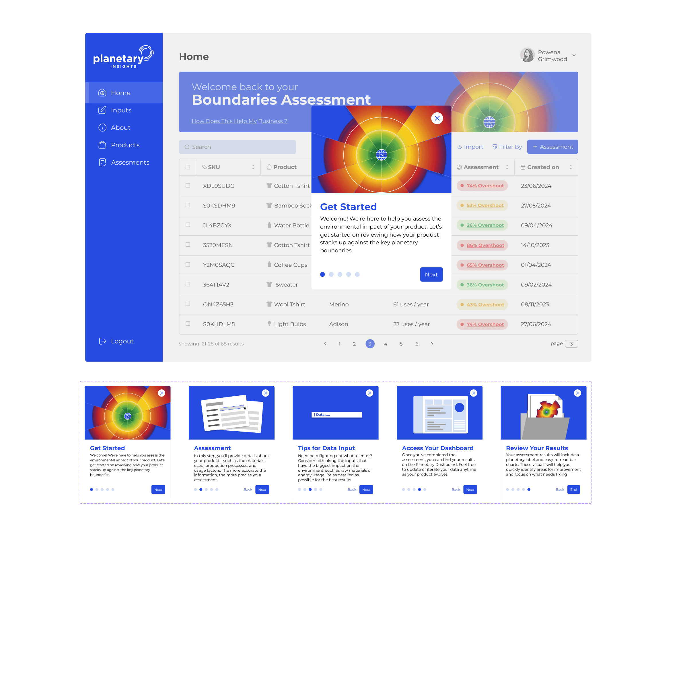
Onboarding Walkthrough
The redesigned onboarding transforms a confusing, one-page entry into a clear, step-by-step welcome experience. On first login, users see a carousel of five concise cards—starting with a friendly welcome and purpose statement, then walking through how to add an assessment, enter data, read the dashboard, and review results.
By breaking the workflow into digestible steps and setting expectations early, this onboarding reduces overwhelm, shortens time-to-value, and ensures every user knows how to get meaningful insights from Planetary Facts—right from day one.
Design System
To ensure consistency, scalability, and rapid iteration, I developed a comprehensive design system that translates visual and interaction patterns into reusable building blocks.
Key elements:
Color palette
Includes primary, status, and neutral tones to support clarity and contrast.Modular typography scale
Ensures readability and hierarchy across different screen sizes.12-column grid and spacing rules
Establishes strong structure and visual alignment throughout the portal.Core UI components
Tables, cards, buttons, inputs, tooltips, and the Planetary Label chart—each documented with states, usage guidelines, and code-ready specs.Utility elements
Icons, dividers, dropdowns—designed for clarity, accessibility, and reusability.


Impacts
After iterating on high‑fidelity prototypes, I conducted moderated usability tests against the original interface to quantify our redesign’s effectiveness. Key improvements included:
◤ Greater usability & satisfaction
Post‑test SUS surveys and open feedback highlighted dramatically improved clarity, confidence, and willingness to reuse the tool—users described the new dashboard as “intuitive,” “efficient,” and “actionable.”
◤ Faster data entry
Task time reduced by 65%. Measured time‑on‑task for “Add new assessment” flow—participants completed the core workflow in under three minutes versus over eight minutes previously.
◤ Higher task success rate
Success rate increased from 58 % to 96 % in prototype testing, nearly all users could complete a full assessment without errors; the original interface saw frequent failures and mis‑entries.
Some Other UIUX Works

@designed by AddieCheung 2024