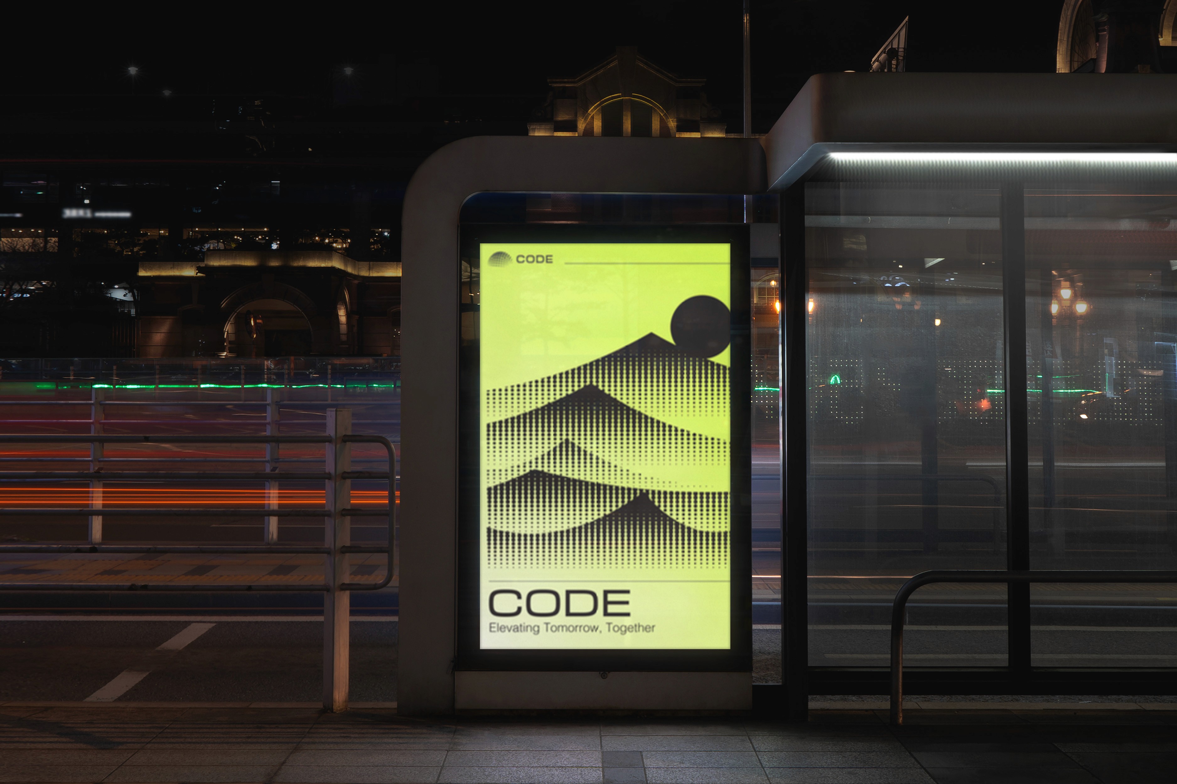
Overview
CODE redefines the digital landscape by creating an immersive ecosystem that bridges industry, community, and policy. They needed a visual identity that not only reflects their role as pioneers of innovation but also resonates with their multifaceted partnerships. 
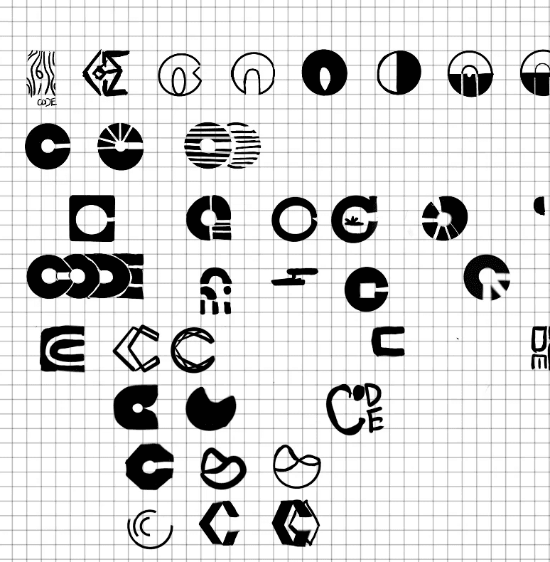
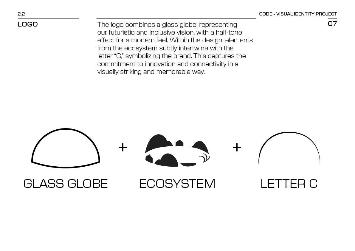
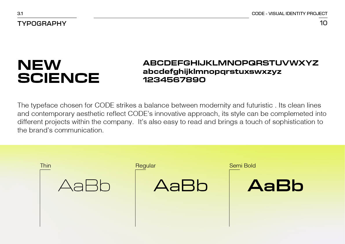
The project aimed to encapsulate CODE’s commitment to pushing boundaries and creating extraordinary experiences. I designed CODE’s visual identity from the ground up, ensuring it aligns with their innovative ethos and immersive vision. This included crafting a logo that represents their role as ecosystem builders, selecting a modern typeface for versatile communication, and developing a color palette that exudes vibrancy and creativity.
Design Highlights
Logo Design: The logo combines elements of a glass globe, an ecosystem, and the letter C to represent CODE’s interconnected world. The halftone effect adds depth and modernity, symbolizing innovation and the digital frontier.
Typography: The chosen typeface, New Science, strikes a balance between futuristic and approachable. Its clean lines and versatility reflect CODE’s commitment to innovation and adaptability across various projects.
Color Palette: Featuring lightning yellow, lime green, and bolt black, the colors convey energy, optimism, and cutting-edge thinking. These shades evoke a sense of innovation while maintaining professionalism.
Ecosystem Visuals: The graphic representations of a lake, mountain, and coast encapsulate the diversity of CODE’s ecosystem, reflecting their multifaceted partnerships and community-driven approach.
Impacts
The visual identity made an attempt to positioned CODE as a leader in innovation and community-building. The dynamic and futuristic branding resonates with partners and stakeholders across industries, reinforcing CODE’s role as a hub for extraordinary experiences.